Blog 10 Dec 2025
Your Website Isn’t a Brochure. It’s a Sales System.
Most small business websites in Australia are digital brochures.
Nice photos. A bit of “About us”. A contact form that no one uses.
The problem?
Brochures don’t answer your phone, book jobs, or fill your calendar.
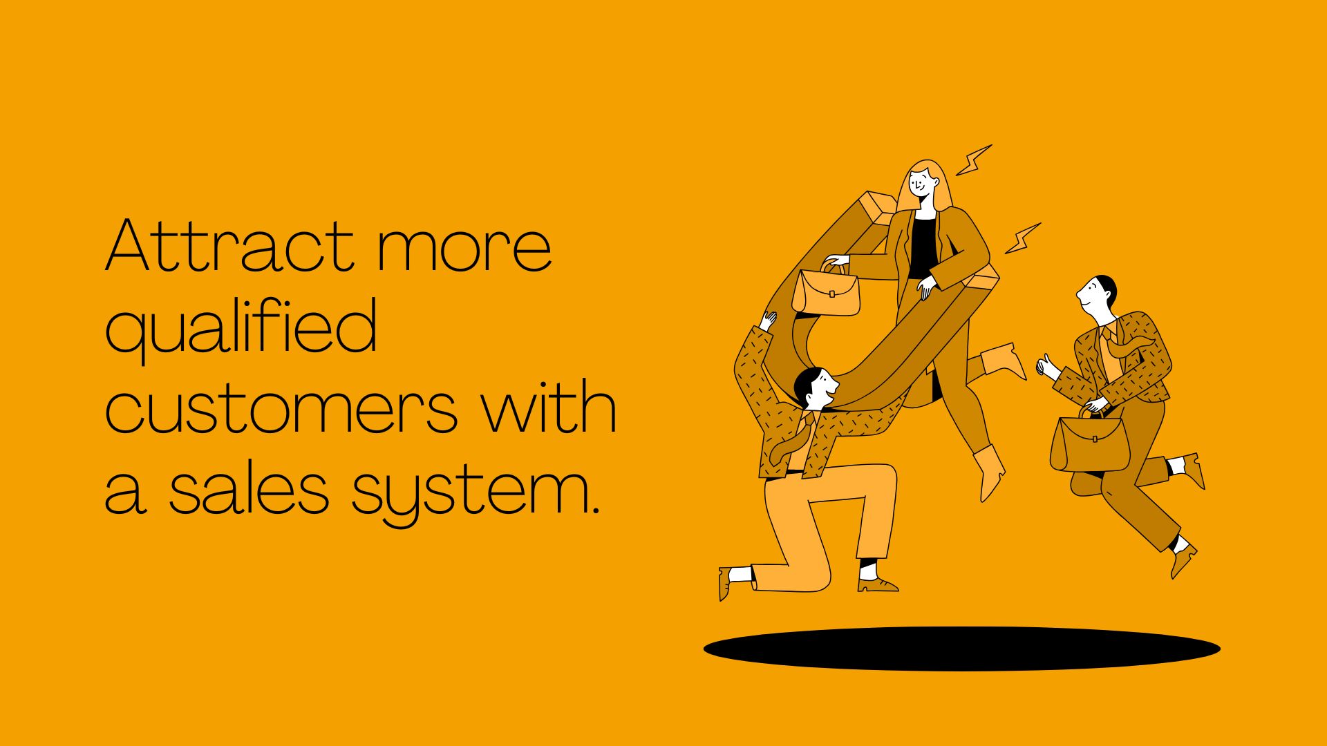
A modern website should work like a sales system, quietly turning Google searches and ad clicks into calls, quote requests and bookings while you’re on the tools or with clients.
At Elev8d, after building and fixing hundreds of sites, we’ve seen the same pattern again and again: when you stop treating your website like a vanity project and start treating it like a sales system, everything changes.
Let’s walk through how.
The Problem With 90% of Small Business Websites
Built for looks, not leads
Most sites are designed like this:
- Designer: “This looks modern and clean.”
- Business owner: “Love the colours. Ship it.”
- Nobody: “Will this actually make the phone ring?”
There’s often no strategy behind the layout. No clear journey from “I’ve landed here” to “I’m ready to enquire”.
Pretty is good.
Pretty and profitable is better.
No clear call to action
Go to ten random small business websites and check the homepage.
You’ll see:
- Multiple buttons doing different things
- A tiny phone number hidden in the header
- A contact form link buried in the menu
- No mention of why someone should act now
If a visitor has to think about what to do next, you’ve lost them.
Confusing layouts and slow load times
Customers are impatient. Especially on a mobile.
If your website:
- Takes more than a couple of seconds to load
- Jumps around while loading (CLS issues / layout shift)
- Has tiny text and buttons on mobile
- Buries important info below big hero images and sliders
…they’ll simply hit back and choose a competitor.
We see this a lot with tradies and local services: the work is outstanding, but the website makes it hard to trust, understand, or contact the business.
The 7 Non-Negotiables of a High Converting Website
If you want your website to behave like a sales system, these are the basics you can’t ignore.
1. A headline that says who you help and what you do
The first thing a visitor should see is a clear, specific statement.
Bad examples:
- “Welcome to ABC Group”
- “Quality you can trust”
- “Solutions for all your needs”
Good examples:
- “Mini digger & landscaping services across South East Melbourne”
- “Bookkeeping for growing Melbourne trades & service businesses”
- “Anxiety & depression counselling for adults in Gold Coast”
Your headline should answer three questions in one glance:
- What do you do?
- Who is it for?
- Where do you operate (if local)?
2. One clear primary call to action
Every page needs one main job.
For most service businesses, that is usually:
- “Call now”
- “Get a quote”
- “Book a consultation”
- “Request a call back”
Choose one as the primary CTA and make it:
- Obvious in the header
- Repeated a few times down the page
- Easy to tap on mobile (big enough button / phone link)
You can still have secondary options (e.g. email) but don’t make visitors choose between five different paths.
3. Proof you’re legit
People don’t want the cheapest; they want the safest good choice.
Your website should show, not tell:
- Reviews & testimonials (screenshots are great)
- Before & after photos (for visual trades / services)
- Logos of brands you stock / work with
- Certifications & memberships
- Guarantees (e.g. “On-time or we knock $X off”)
Think of this as the online version of a mate saying, “Yeah, they’re good. I’ve used them.”
4. Simple, mobile-first design
Most local business traffic is now mobile. Yet many websites are still designed on a big desktop screen and only “checked” on mobile at the end.
Mobile first means:
- Buttons and phone numbers are big and thumb-friendly
- Text is readable without zooming
- Important information is above the fold
- No horizontal scrolling
- Forms are short and easy to complete
If it’s annoying to use on your phone, your leads are leaking.
5. Fast load speeds and clean Core Web Vitals
Speed is not just a “tech” metric, it’s a sales metric.
Slow sites:
- Lose impatient visitors
- Rank worse on Google
- Make your ads more expensive (worse quality scores)
You don’t need to obsess over every micro-metric, but you do want:
- Pages to load in a couple of seconds
- No huge bloated images
- Code and tracking kept lean
- Core Web Vitals (LCP, CLS, FID) in the green where possible
At Elev8d we literally tie final payments for some builds to achieving green Core Web Vitals because performance and profit are connected.
6. Clear service paths
Don’t make people hunt for what they need.
Great sales system websites group services into clear, clickable paths. For example:
- “Mini Digger Hire”
- “Landscaping & Retaining Walls”
- “Driveways & Concrete”
Or for a professional service:
- “Bookkeeping for Tradies”
- “Bookkeeping for Agencies”
- “Bookkeeping for E-commerce”
Each path leads to a focused page that answers:
- What exactly is included
- Who it’s for
- Why it’s better / different
- What happens next (process)
- How to get started (CTA)
7. Tracking in place, so you know what works
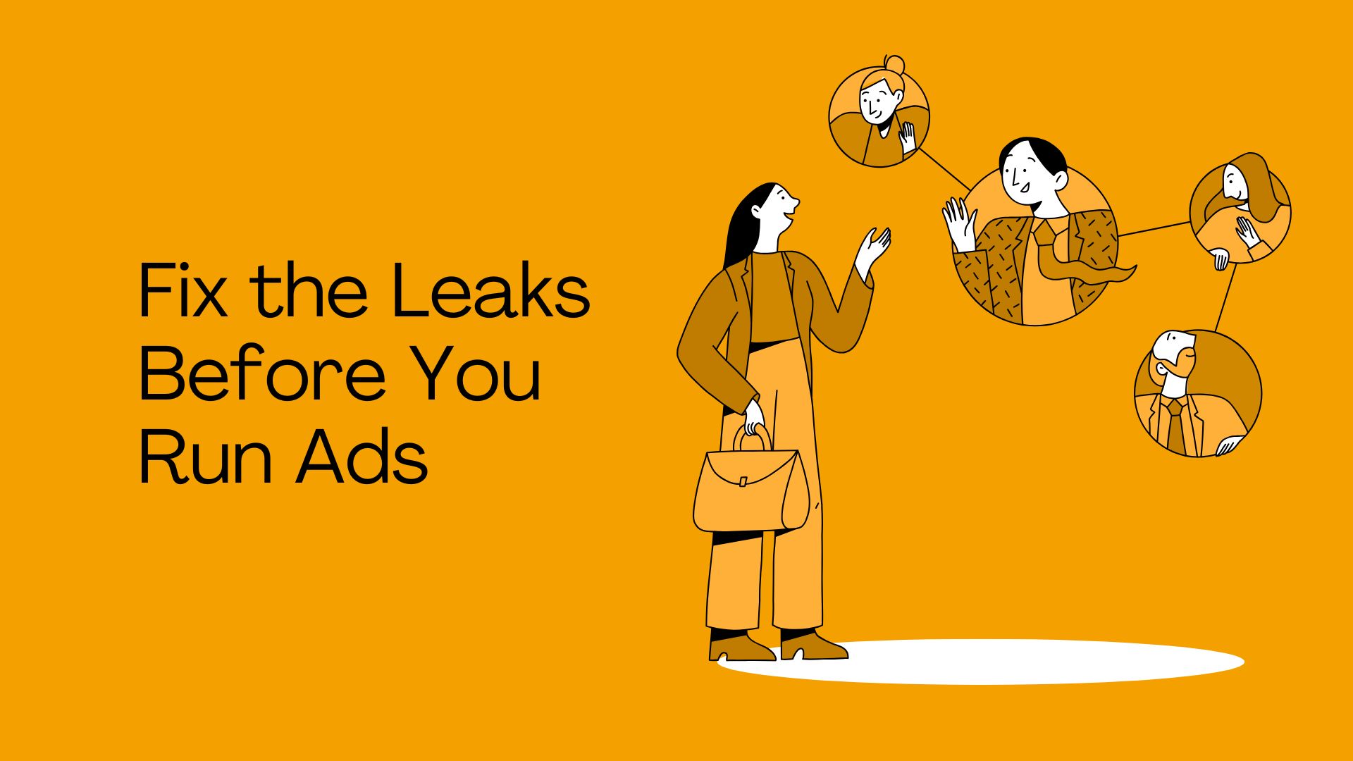
A true sales system doesn’t just get leads, it tells you where they came from.
At minimum, you want:
- Google Analytics 4 set up properly
- Key conversions tracked (calls, forms, bookings, quote requests)
- Call tracking or at least click to call tracking
- Basic tagging for Google Ads / Meta (if you run ads)
This lets you answer questions like:
- “Which pages bring the most enquiries?”
- “Are we getting more leads from SEO or from ads?”
- “Which suburb pages are actually performing?”
Without tracking, you’re flying blind.
How to Audit Your Own Website in 10 Minutes
Grab your phone and look at your website as if you were a new customer.
Give yourself a tick or a cross on each:
- Headline
- Does it clearly say what you do, for whom, and where?
- Primary CTA
- Is there one obvious next step?
- Is it easy to tap or click?
- Trust elements
- Can I see reviews, photos, or proof within a few seconds?
- Mobile experience
- Is the text readable?
- Are buttons easy to tap?
- Any annoying zooming or scrolling?
- Speed
- Does the page load quickly, or do you sit staring at a blank screen?
- Service paths
- Can I quickly find the exact service I’m interested in?
- Tracking
- Do you actually know how many calls, forms and bookings come from your website each month?
If you’re missing more than two or three of these, your website is probably behaving more like a brochure than a sales system.
If You Don’t Have Time for All This…
Most business owners don’t wake up excited to tweak Core Web Vitals or design wireframes.
That’s where we come in.
At Elev8d, we specialise in building websites and systems that actually move the needle:
- We start with the sales system first, offer, positioning, CTAs, tracking.
- We design for mobile and conversions, not just looks.
- We optimise performance so you’re not losing leads to slow pages.
- We plug in tracking so you can see what’s working.
For some businesses, we even pre-build a demo homepage based on your brand and services, so you can see exactly how your website could work as a sales system before you commit.
If you’d like to stop treating your website like a brochure and start using it as a proper sales engine, we’d be happy to show you what that looks like.